
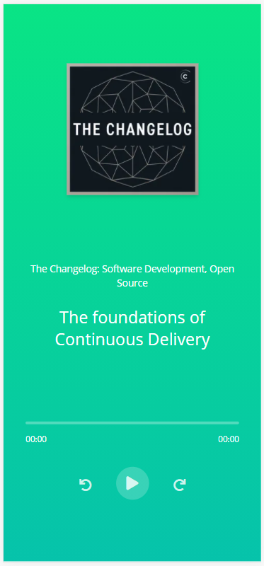
Today I ran into the problem of trying three objects, evenly spaced on the screen of a mobile device. But that brought more trouble than I initially thought. It's a pretty common scenario. In my case, it was for a podcast view and trying to fit a title, a poster image, and the controls above the fold. It could also be a landing page where you want to fit an interesting title, a blurp, and a call to action button on the first screen that the users see.
We know that we want the content centered on the page and that we need some space in between. It sounds like a job for Flex!
<div class="screen">
  <div class="centered-content">
    <div class="centered-content__item">
      <h1>Make up to $35 Driving Your Car</h1>
    </div>
    <div class="centered-content__item">
      <p>How many ours do you want to drive per week?</p>
    </div>
    <div class="centered-content__item">
      <button>Become a Driver</button>
    </div>
  </div>
</div>
.screen {
height: 100vh;
width: 100%;
}
.centered-content {
align-items: center;
display: flex;
flex-direction: column;
height: 100%;
justify-content: center;
text-align: center;
width: 100%;
}
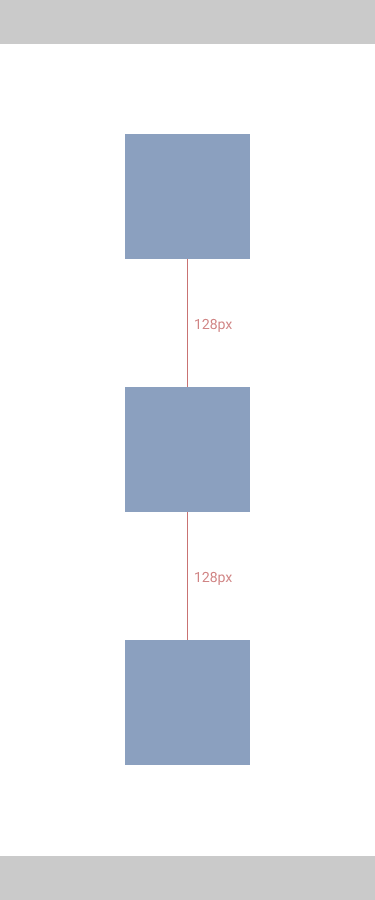
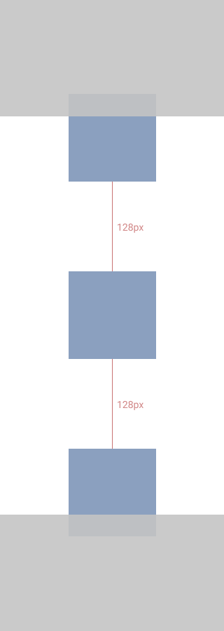
.centered-content__item {
margin-bottom: 128px;
}
So let's break this down:
- First, we create a container that will cover the whole screen.
- Inside the container, we use Flex to center the content.
- We add a margin to the bottom of each item so that they have some room to breathe.
Pretty good so far. 🎉
But when we try it on a smaller screen, the content won't fit. Because of the fixed margin, the content will take up the same amount of space on any screen and that becomes a problem here.
One approach to this would be to use Media Queries. That way, we can conditionally format the content depending on the screen height. I would like to avoid that. Even though Media Queries gives you a lot of control, it also adds extra complexity to our stylesheets.
So thinking a bit more about the spacing, we want it dynamically adjust
depending on the space available. We can use justify-content: space-between
which spreads the items out evenly.
.centered-content {
  align-items: center;
  display: flex;
  flex-direction: column;
  height: 100%;
  justify-content: space-between;
  text-align: center;
  width: 100%;
}
This works a lot better on our small device. But now there is way too much space between the items on a bigger screen.


In situations like this, when we have conflicting behavior, it's because we want to do too many things. We need to cut boards and punch nails and we are trying to get our hammer to do both. The good thing about programming is that we can create new tools! We can add a new class that spaces the content out.
.centered-content {
align-items: center;
display: flex;
flex-direction: column;
height: 100%;
justify-content: center;
text-align: center;
}
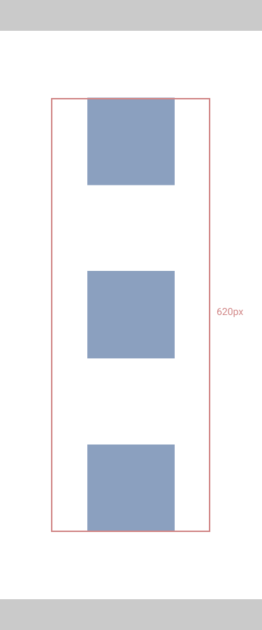
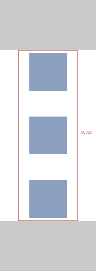
.centered-content__evenly-spaced {
display: flex;
flex-direction: column;
justify-content: space-between;
height: 100%;
max-height: 620px;
}
This way, we have a whole new class that's only responsible for handling the spacing of the items. The interesting addition here is that it will fill the whole screen on smaller screens.
But as the screen grows in height, the max-height property will limit how big
it can get to avoid spacing things out too much.
<div class="screen">
  <div class="centered-content">
    <div class="centered-content__evenly-spaced">
      <div>
        <h1>Make up to $35 Driving Your Car</h1>
      </div>

      <div>
        <p>How many ours do you want to drive per week?</p>
      </div>

      <div>
        <button>Become a Driver</button>
      </div>
    </div>
  </div>
</div>
.screen {
  height: 100vh;
  width: 100%;
}

.centered-content {
  align-items: center;
  display: flex;
  flex-direction: column;
  height: 100%;
  justify-content: center;
  text-align: center;
}

.centered-content__evenly-spaced {
  display: flex;
  flex-direction: column;
  justify-content: space-between;
  height: 100%;
  max-height: 620px;
}


There is a lot of awesome tools we can use to create beautiful layouts but it still has a lot of challenges, especially in a world of a multitude of different screen sizes and devices.
Focusing on the different behaviors we want to accomplish is a good way to break things down. When things are getting too complex, try to keep each part simple and with their own responsibility.